Installation view of Sarah Goffman, Untitled, 2025, window painting using Jif cream cleanser, dimensions variable, HAIR. Photo: HAIR.
Poem for a Circle
by Emily Kostos
Petal. Arrow. Left. Right. Rose. Nuclear. 0. O. 9. (()). These words and keystrokes, along with a proliferation of lines, swirls and other forms, drift, orbit, and coalesce in Poem for a Circle, a group exhibition currently showing at HAIR ARI. Located opposite the Queen Victoria Market in Naarm’s CBD, the gallery was opened in January 2024 by RMIT Fine Art alumni, Cristea Nian Zhao and Jincheng Deng. Notably, all six exhibiting artists and visual poets are female and have a particular focus on the subject of language, including its visual, sensorial, and material forms. The exhibition’s formation was a collaborative effort between artists Darcey Bella Arnold, Emily Floyd, and Ella Skilbeck-Porter, with the later inclusion of Sandy Caldow and t h a l i a. Sarah Goffman’s Jif cream text “POE/TRY”(2025) on the gallery’s front window was a performance made during the closing event for the previous group exhibition, 90 Seconds to Midnight. Given the theme of the current show, the work was kept. There is a strong community ethos underpinning the exhibition: Floyd, Skilbeck-Porter, and Caldow are all neighbours (t h a l i a also lives nearby), and a range of both emerging and established art practices (in fact, this is the first time Skilbeck-Porter has exhibited her work in a gallery setting).
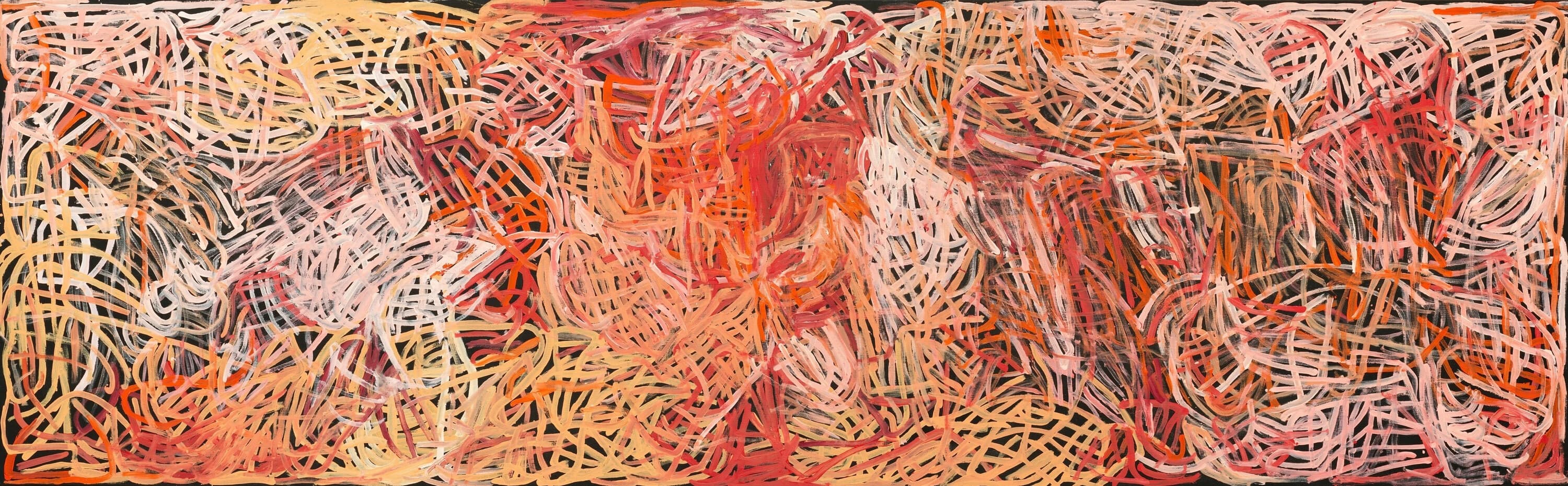
The shopfront was formerly the hairdresser “Australiana Hair” (the name was enclosed within a map of Australia on the shop’s hanging sign, now removed at the request of Melbourne City Council). The interior was gutted, but for a half-tiled wall and two sets of water taps that remain on the far wall. Entering the gallery through a recessed door, there is no trace of the leather swivel chairs and mirrors that previously occupied the space. Instead, there is a careful selection of wall-based work and sculpture. Alongside the exhibition, a large red triangle (unmistakably by Floyd) houses a browsing library of visual poetry books by several of the artists, including Arnold’s recent publication “a measurement of disorder” (2025). The largest wall work in the space is a two-metre-wide painting and visual poem by Arnold. Titled Left Right (breastfeeding poem) (2023), two large Os hover with the words “left” and “right” encased appropriately inside of each. The circle is a shared linguistic, formal, and symbolic form in several of these artists’ practices. In Skilbeck-Porter’s exhibition text, she describes the circle in relation to Arnold’s work, “the O becomes in turn the mother’s body that breastfeeds, circulating white ink in a feedback loop.” Gazing at Arnold’s work, I try to break this signifier apart: the Os are more like ovals (Arnold has digitally altered the Times New Roman text, before stenciling it onto the canvas surface) and, with their sheer size, invite associations with the enormity of breastfeeding in early motherhood. Arnold tells me that she made this work while on maternity leave with her daughter, Sidney, and began recording the amount of time her daughter spent feeding on each breast. Political allegiances for the “left” and “right” were also on the artist’s mind, and the painting’s structure shows how such categorisations can confine individuals within closed circles.

Installation view of Darcey Bella Arnold, Left Right (breastfeeding poem), 2023, acrylic and flashe on cotton duck, 150 x 200 cm, HAIR. Photo: HAIR.
Floyd’s sculpture appears as though the letters and shapes in Arnold’s work have materialised on the floor. Titled Kesh Letterset (2017), this sculptural installation is an extension of Floyd’s interest in speculative worlds. The alphabet, which Floyd digitised and is now readily available online, references a fictional alphabet from Ursula Le Guin’s speculative fiction “Always Coming Home” (1985), an invented anthropological study of an alternative, matriarchal society of Pacific Coast peoples called the Kesh. Floyd has laser-cut the alphabet (some letters appear very close to our conventional 9s and 6s), and then carefully placed them in a mound on the gallery floor. Floyd tells me that the letters have been coated in black oxide, the same non-reflective and anti-corrosive medium used to blacken guns and weaponry. Prior to knowing this, the linguistic forms bring to mind foam letters that children stick to tiled walls in bathtubs, an early introduction to the alphabet, numbers and reading. Floyd is known for her interest in children’s toys (her parents ran a toy manufacturing business in nearby Collingwood), pedagogy, and the creation of other worlds. By taking the language of Le Guin’s Kesh utopia as her focus, Floyd invites reflection on the evolving semantic dimensions of language, as well as its corporeal possibilities: it becomes something we move through with our bodies, felt and experienced, rather than simply read or spoken.

Installation view of Emily Floyd, Kesh Letterpress, 2017, steel with black oxide coating, dimensions variable, HAIR. Photo: HAIR.
Poem for a Circle coincided with a symposium “Enduring Experimental Poets,” presented by un Projects and the Melbourne School of Literature. Skilbeck-Porter presented an engaging and rigorous presentation on t h a l i a. Alongside her academic research, Skilbeck-Porter has maintained a visual practice since her twenties and has seven visual poems in the show. Three of these, situated to the left of Arnold’s painting, are from her poetry collection, “These Are Different Waters” (2023), which takes a community swimming pool as its central motif. The other four visual poems, installed to the right of Arnold’s painting, were made during a recent research trip to France and include multiple text pastings, rotations, re-arrangements and slippages of overlapping text. They bring to mind the moiré-like flickers of Rosmarie Waldrop’s visual poems (particularly from her 1970 text, “Camp Printing”): visual permutations that upend the reader’s eye and demand a head tilt to engage. Read sinistrodextrally, Skilbeck-Porter’s first visual poem, Concrete Pool (Three Swims) (a series of three pages), features a combination of keystrokes and Times New Roman text, including musings on the work of American modernist painter, Agnes Martin:
agnes drawing line after line on walls
and in sand in the New Mexico desert
it would take ~ four hours of straight
swimming to replicate a gridpainting
This text is followed by a series of keystroke brackets or “crescents.” Speaking with Skilbeck-Porter, she tells me that the crescent is a central motif in her current practice (the working title for her upcoming book is “Crescent crescent” which will include circle drawing poems made with her daughter). Here, the crescent is both a fragment and whole, absence and presence, a slither hinting at illumination. The simplicity and monotony of the third visual poem here interests me. The word notation alternates with natation—French for “swimming”—across five lines. Skilbeck-Porter describes the text-like freestyle strokes, with each word-spacing interspersing a breath. I am called to orate these words; it comes as no surprise that Skilbeck-Porter has performed this as a sound poem on several occasions.

Installation view of Ella Skilbeck-Porter, Concrete Pool (Three Swims), 2023, inkjet prints on paper, 230 x 420 mm each, HAIR. Photo: HAIR.
A selection of five visual poems and an oil painting by t h a l i a occupies the wall directly opposite Arnold and Skilbeck-Porter. Well known within poetry circles, t h a l i a’s work has largely been overlooked across the last three decades. Worker exploitation, anarchist politics, and feminism are recurrent themes in her practice, one that has spanned five decades. t h a l i a’s five visual poems are hung in an upward turned crescent (Skilbeck-Porter’s upright crescents now recline in a new form), a feminine revolt against the sharpness of a straight line. The titles combine several words using Pitman shorthand (t h a l i a worked as a typist and secretary in her twenties before suffering from tenosynovitis) and are often phrase-like. Each work is accompanied by the corresponding shorthand translation at the bottom of the page to assist in understanding the various words in the poem. In Critique Literature Knowledge Analysis Feminist Still (1986) four dolphins poke their rostrums skywards. The curved and hooked lines appear score-like and carefully composed—the shorthand symbol for “knowledge” resembles an eighth note musical rest.

Installation view of t h a l i a, Work Title, date, medium, dimensions, location, url. Credit and additional information supplied in a separate sentence. Photo: Photographer Name
Nuclear Fears (1986), a painting nested above t h a l i a’s five visual poems on paper, initially made me think of a full moon, one with a semi-abstracted feminine form carefully painted in its interior. On closer inspective, one finds the shorthand symbols for “nuclear” and “fears.” Her poem the moon is (from the 1998 collection “New & selected poems”) comes to mind—there is a sharp edge to something beguiling and seemingly innocent. Dedicated to her younger brother, the poet π.O, and partner Sandy Caldow—and written on their kitchen table—the sixth stanza reads:
the moon has turned to hide from the cops.
the moon is serenading a tune.
a possum suicides on a powerline in front of the moon.
a stingray basks in the moon.
Floyd tells me that t h a l i a’s use of Blu Tack to affix her prints directly to the wall is a deliberate and conscious one, and how it lends the work an intimacy, with the trace of her fingerprints evident in the work. In t h a l i a’s outdoor graffiti works there is a similar immediacy, where she uses glass pebbles to compose shorthand text on outdoor walls (π.O describes them as “bejewelled graffiti”).
The shared durability of artworks outdoors directs me to the work of Caldow and her ceramic egg, which perches on the gallery’s window sill (a late edition to the show and therefore not in the exhibition list). Stamped with words including “petal,” “breeze,” and “sea,” it appears as though it might be some sort of contemporary clay tablet. Active since the 1980s as an artist, sculptor, and poet, Caldow has followed enduring interests in ecology, gender identity, and place. Her diptych of two circular oil paintings hangs on the gallery’s back wall, positioned above head height so as to avoid the tiled section of the wall below. These moon-like black canvases have pinewood letters adhered to their surface in a crossword-like fashion, with words such as “rose,” “arrow,” and “petal” standing out (R, S, & E are painted in a reddish hue that sets them apart). They bring to mind the circular paintings of British artist Hannah Black, titled HUSH MR GIANT (2025), which also feature spiraling text. In Arose, A Row, A Rose (2017), an O is distinguished with gold leaf, an ecological halo that is perhaps Caldow’s own shorthand for natural cycles and continuity.

Installation view of Sandy Caldow, Arose, A Row, A Rose, 2017, pine wood, gold leaf, synthetic polymer paint on canvas, HAIR. Photo: HAIR.
Australian experimental poet and literary critic, aj carruthers, has described t h a l i a’s practice as one with a “devotional sensibility of a kind comparable to artists like Hanne Darboven, Agnes Martin, or Channa Horwitz.” All six artists share a similar, ritualistic dedication to practice, each with a lifelong commitment to furthering the visual, material, and physical properties of language. The divide between text and image has often reflected broader gender hierarchies, with women’s intermedia practice having largely been unacknowledged. As a presentation of female Melbourne-based artists, Poem for a Circle becomes a bold statement about the significance of women’s practices that use word as image. A recovery of longstanding practices that shuns easy categorisation, this exhibition expands the possibilities of language’s materially, sidestepping the usual constructs that reinforce binaries between the visual and text.
Emily Kostos is an art therapist, artist and writer in Naarm/Melbourne.